Contributors

Tuesday, May 15, 2012

Phase III update

Some updates for my Phase III submissions.

Props:

Revolver
The revolver uses nuclear fusion as its power source. I looked at Smith and Wessons for the nub nose design, but ended up going with a more heavy duty body. The revolver chamber is actually the container for the solenoid coils that charges each shot that comes from the fusion cell at the base of the handle.
I played with the glow effects. I felt the ones with the body glowing to be too excessive. I decided to combine the simple body of the gun on the bottom with the barrel from the one on the right.

Final design for Chevy Carter's revolver.


DIBBS
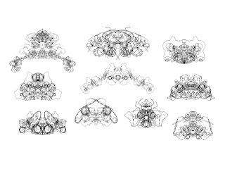
I used alchemy to produce the silhouettes for the DIBBS. I played around with different ways to create an imposing object that would be difficult to remove. DIBBS are suppose to be place holders for people who literally want Dibbs on something.


I've got Dibbs on DIBBS!


Environments:

Clock Tower
I tried playing around with minimalist designs fro the clock tower since minimalism started to become prominent in the 1950s. However, I liked the quirky zany feel of a world where objects look like familiar everyday things. This resulted in a tower that used cogs as its design motif.

I had some perspective issues with the value render. The Aerial perspective effect isn't too bad though.

After some perspective tweaks with some red and blue lights, the scene looks reminiscent of Blade Runner.


Bucky Theater
Buckminster Fuller is one of my heroes for his visionary talents. His most celebrated designs today is the Bucky Ball which can now be seen at the Epcot Center. I originally designed the building to look like a movie projector, but since the ball is already minimalist, I might as well go that route.

The top one looked too Epcot, the left is a glowing soccer ball. I went with the bottom one because it reminds us of something vaguely sci fi, modern era-ish. I really liked the contrast between the round sphere and the triangular body.

different color designs for the theater as the gas tubes change colors periodically.


Wednesday, May 2, 2012

Cerebus Feature Film

Hi everyone, I just want to advertise for a feature film currently in development called "Cerebus". It is based on the comic book "Cerebus" which inspired graphic novelists like Jeff Smith. It is written and illustrated by Dave Sim and today, it is one of the longest running English language comic book series ever printed. I happen to have the good fortune of being contacted by Oliver Simonsen of What Comics Entertainment to animate a short scene for the feature film.

Come join the fight and follow up on Cerebus the Aardvark's progress!

Click Here to access the link to my animation contribution to "Cerebus" the animated feature.

Saturday, April 28, 2012

Sequential Art Senior Project Phase I and II


It is the end of midterm week at SCAD. Being the usual busy bee, I am taking two senior project courses for my sequential art and animation majors. For the sequential art project, I am working on 2 character, 2 vehicles, 2 props, 2 environment, 2 final concept illustrations, along with a 200 panel storyboard, and a written treatment for my video game concept.

"Think Fast" is the name of my senior project; it is about Chevy Ford Carter, a private investigator from Buckysville who is disgruntled about his boring job until he picks up a case on a killer beatnik robot. The story aesthetics are influenced by the 1950s and features dark humor with science fiction elements of the Fall Out series while retaining a quirkiness found in the Sci-Fy channel series Eureka.

So far I have completed 10 thumbnail sketches for each character/vehicle, 3 value studies for each character/vehicle, and 1 full color concept illustrations for each character/vehicle. Enjoy!
From this silhouette study, I felt that the ones where Chevy's shoulders are sagging with an unbuttoned coat were strongest at portraying an unkempt and unhappy fellow.
The value study portion. I noticed that my design did not look sci fi enough, in fact the character looked almost stereotypical.

Final Protagonist Character Concept for Chevy Ford Carter


Jack Nick has to look human so all the wacky designs with bulbous looking robots are out. In here, I started adding in clothing to give the robot a more interesting silhouette design. I focused primarily on the sunglasses and the V shape it created. I liked the silhouettes where Jack Nick looks tough and has strong arms to contrast with the thin arms. My influence for the clothing was Bob Dylan.


I thought the ones with the curved shapes were too feminine and not masculine enough. The one I selected repeated that V shape over and over and over.


Final Antagonist Character Concept for Beatnik Nick the Robot
The Ford Nucleon was also designed by the robot's creator. It is the only civilian flying car since law forbids average citizens from having one due to potential traffic hazards. The historical Nucleons were supposed to have a nuclear reactor as its power source. Obvious concerns over radiation poisoning and other hazards caused it to be scrapped. had a lot of fun designing the Nucleon. It had to sleek, fast, and agile. The first couple of designs were not my favorites because they looked too much like muscle cars. The final design actually had a shape that contrasts well with the police car.


I liked the one that had chromium covering the entire chassis. However, it did not seem like such an appealing design because it would be really bland. The Ford Nucleon has to be edgy with bright colors.


Final Nucleon Vehicle Concept
Police cars from the 1950s had a charm to it because of the way the passenger compartment rides closely to the back. The police cars have to contrast sharply with the nucleon in that it has to be imposing, strong, and powerful. Some of the silhouettes looked like taxi cabs and others were too futuristic. The most successful one has a powerful front and the back features a propulsion system seen only in a sci fi world.


I played around mostly with the front and back design for the police car. I liked the more stable and reliable look of having two fins in the back. I also added in one of those sirens from the 1950s which had to be placed outside to be heard.
Police Car Vehicle Concept


Tuesday, January 31, 2012

GENERATE 24 Hour Art Challenge Fall 2011

So I am finally uploading my GENERATE 2011 character concepts. The challenge last year was to make a pitch to Turner Studios for a tv program that lasts 26 episodes. Each team can have 4 members. Each team is given a sponsor and a tv channel to pitch to. The teams have to create a pitch to explain what our show is about, a 26 episode summary list, 3-5 character concept full colors, 3 marketing products, as well as a working animatic. I helped with a majority of the story development, proofread the summaries, delivered the pitch, illustrated the final character concepts, and worked on the animatic. At the same time, I had to manage the team to make sure we are on time and that each member has someone else to help them with the work.

Our team came received SciFi channel, and AT&T as our sponsor. Our story is called "Fail Safe". It is about a company that created genetic superhumans to help with jobs considered too dangerous for normal people. However, the experiments went rogue and innocent bystanders were killed. To rectify their mistake, the company sends Alan, their Fail Safe to track down and eliminate the experiments. Along the way, Alan finds out that he and the experiments are very alike and it is up to him to determine whether to go through with his mission, side with his people, or find some way to make a compromise.

We came in third place at GENERATE and the people at Turner said that our show could potentially spawn up to 10 seasons in concept. Not too shabby considering that it was my first time working the Animation challenge. So without much ado, here are some of the character concepts I have helped come up with.

Alan- Main protagonist

Correspondent who keeps in touch with Alan with his missions.

Lucas- the news journalist investigating what went on with the experiments. He eventually meets Alan and they form a partnership.

Winter Candyland

So during the winter, I got a commission to illustrated a winter wonderland. I thought, "wouldn't it be cool if the characters ventured in on candy land?" Well here it is. I still have a few more revisions to do like adding snow onto the candy and the tree in the background.


Hades Concept Art: Color Study

So after my value study, I have finally completed the colors. I might play around with the blue since some people told me it reminds them of Poseidon. Apparently the original Hades has black as a motif but if that's the case, I might as well leave it in value study (and black is not a color).

Hades Color Study #1

Sunday, December 11, 2011

Hades Concept Art: Value Study

So Concept Art Factory has been a bit sluggish lately so a couple friends of mine have decided to start on a series of projects involving the revamping of Greek Mythological characters.

I know it has been done to death, but there have been so many misinterpretation of Hades. People see him as the grim reaper because of Judeo Christian interpretation but the original Greek Hades was far from sinister.

I gave him somewhat a druidic look with the skull/athenian style helmet. Cerberus is referenced in his shoulder pauldron and the dog skin sleeve covering. His body twists like cypress tree roots and I thought it'd be a nice theme to tie him in with my next design with Persephone.

Hades Concept

Saturday, September 3, 2011

Smuggler Vehicle

So as a continuation for my concept art class assignment, we have to design a vehicle for one of our characters in the story we had created. This speeder is designed for my smuggler. The world I have created is like a sci-fi western so the head of the speeder looks like a horse and the back of the speeder is a compartment for the smuggler to hide his stuff in. I kept to the circular designs because the vehicle uses magnets as a way to levitate.

Vehicles in the world of Pleiades 7 will use an electromagnetic propulsion system. It manipulates the magnetic field around them by mimicking the same charge as the electrons in the field around the vehicle. In magnetism, opposite forces attract and similar forces repel each other. In theory, if the propulsion system is equal in charge and greater in strength to the magnetic field, the vehicle will achieve levitation. The magnetic solenoid pads can swivel so that the speeder is able to move in all direction/rotation- it can even do barrel rolls. The smaller magnetic pad at the top can also be used to set the speeder upright if it topples over.


Wednesday, August 3, 2011

Color Studies for Concept Art Factory

After having completed my value studies, I started on my color studies for the protagonist and antagonist characters for my story. I take the strongest value study and develop it further by adding color layers. The color layer allows me to change the scheme to which ever I want and see if the new designs echo what I want my character to look like.


My Five Color Studies. I played around with cape colors, and the eye glow.


Version 1

Version 2

Version 3

Version 4

Version 5


Saturday, July 23, 2011

Value Studies for Concept Art Factory

Hey everyone! Today I am posting my value studies for the selected silhouettes from last week's post. My theme is smuggler and law men in space.

Smuggler- Protagonist

I am really liking the smuggler's asymmetrical design because it enhances his villainous qualities. He starts off as a black and white character but gradually becomes morally grey as he betrays the people he works for. I kinda liked the scaled plates since they remind me of a snake or serpent which illicit a strong connotation of villany, but I felt that the one with the bamboo-like armor represents a more slapdash assortment of items. The story is designed for a game so the character should be customizeable which means this character is a stock character (the character players start off with before they customize him/her). In the final design I will make him modular once I have the design for the props completed. So stay tune for the final illustration!

Lawman- Antagonist
The lawman was giving me some problems in the beginning because I wanted something tough but also space worthy. My initial designs featured a man in a powersuit with armor reminescent of judge dredd. As i designed more and more, logistics made it seem odd as to why a law man would be wearing such bulky armor. The concept of armor is more for mercenaries and soldiers rather than a lawman. As a result, I turned to more down to earth references like SWAT and rangers which I feel yielded better results. The final value study depicts the law man with an open jacket with a badge, shin guards and elbow guards for roughin' it, and his wide brim hat. Since the character has an open jacket, he seems rather relaxed so to keep the idea of some professionalism, the hat is designed to look straight and stiff. I will be doing some value studies next week so wait for more to come!

Saturday, July 9, 2011

Silhouettes for Concept Art Factory Design Challenge

Hey everyone, we are in week 13 of the SCAD Concept Art Factory Club sketch challenge. Usually we do a speed paint but this time we want to focus on design rather than the illustration aspect of Concept Art. All good concept art pieces start off with that nugget of idea which we develop into quick drawings called Silhouettes. In the silhouette stage, we try to use surface shapes to develop the personality of the character we are trying to create.

This week, members of the club choose any sort of theme they want, whether it is robot wars, or space western. They then choose two characters from the story they have developed and create as many thumbnails as they can in the 90 minutes period. For my theme, I chose Space Western with Asian theme.


The two characters I will be developing are the smuggler and the lawman.

When I started designing the smuggler, I thought about clint eastwood and the stereotypical bandito from western films. They usually wear the iconic poncho and hat. I took the idea of the poncho, but changed the sombrero to the asian bamboo straw hat. I also made sure the poncho covers only a portion of the body to make the silhouette look asymmetrical. The smuggler in my story is a lone wolf and is dangerous so the asymmetry makes him look less orderly and more chaotic. I chose the snake as a motif for the character because the poncho creates a silhouette similar to the hood of a cobra. The contrasting creature to the cobra would be the eagle.


For the Law man, I wanted to use the eagle motif as a contrast to the smugger's cobra. I also remember judge dredd with eagle wings as the shoulder pauldron design. I initially tried some armors but the lawman ended up looking very much like mercenaries and soldiers than "lawman". Robo cop didnt work either because he looked more soldier than lawman. That's when I remembered the rangers from Fall Out had armor and the cowboy hat so I took that idea and ran with it.

Sunday, June 26, 2011

SCAD Concept Art Speed Paint Challenge

Alright guys, its another edition of the SCAD Concept Art Factory Speed Paint Challenge submission! This time we are doing a 3 hour concept piece about cyborg crustaceans versus fungal natives and combines environment, architecture, vehicle, character design, and architectural design- WOW! so here it is after 3 hours and a additional 2 hour tweak.

I will go back and rework the foreground tree when I have time since it seems have the same saturation as the one in the immediate background.


Wednesday, June 15, 2011

RIFT Colossus Challenge- Life Elemental

Awww yeah, finally finished my concept piece for the Rift Colossus challenge. Though I wanted to do all six elementals (fire, water, earth, wind, life, and death) I have narrowed down to two that are more obscure and challenging to do and they are life and death. Life was rather hard to tackle because you do want it to look too much like earth and its kinda weird saying that I am killing someone with life damage. I figured life would be kind of like a cancerous vegetation growth that continues to grow till it over flows its boundaries much like the Yavimaya forest from the Magic the Gathering Series.

My inspiration for this piece is the Corpse Flower. How ironic that something that is used to depict a life elemental is named after something that is related to death! I wanted to throw together a piece about creation and destruction with the two elementals because they go hand in hand, neither one is stronger than the other. So here is my process leading up to the finished Life Elemental concept painting.

I first laid out the base color I will be using predominantly through the scene. I normally use purple and yellow as my color palette but this time I decided to go with blue and green since it fits with nature more. I will be using purple and yellow more in my death piece because purple is more unnatural and exudes a mysterious atmosphere.

I then gestured out the silhouette with the base tone that will make the creature pop up from the background. I chose a reddish purple because the corpse flowers have that violet red petal.

I then added in vegetation to the layer below all my subsequent layers since it will be pushed back by the flowers coming out the creatures body. I also went ahead and rendered in objects that will be pushed back like the arms and legs. I referenced bristlecone pine trees because they have that unique twist to the trunk along with the beautiful crevasses produced by its knots.

I then painted in the more prominent objects like the corpse flowers and the left arm which is larger.

I finished off the character concept with final details like the dots characteristic to corpse flowers, the teeth to enhance the fantastical quality of the creature as well as tweaked the saturation so that the creature will stand out from the environment I will be creating.

I blocked in the environment into two major portions, the sky and the ground. I used some texture brushes to indicated where trees are going to go.

I then refined the background further to get rid of the texture brush place holders and started working on aerial perspective. I refined the water fall since it is so far away in the background. I also used a but of Sfumato on the bushs in the background. I also saturated the foreground so that it stands out from the desaturated background.

Started to add in some palm trees.

Now I have to work in the foreground.

Then I add in final details.

And to finish off the piece, I tweak the saturation more so that I have a series of contrasting layer with darker colors, lighter colors, and darker colors to make my environment and creature stand apart from one another.

So that's it for my Life Elemental. The entire process took me about two days nonstop. Stay tuned for DEATH!!!