For this Massfx project, I am have broken down castle walls. Courtesy of the 3Ds Max Tutorial Channel on Youtube:
http://www.youtube.com/watch?v=ACrhTDu66rA&feature=plcp

Friday, July 20, 2012
3Ds Max Massfx project I
I am currently learning how to use scripts and Massfx for particle animation in 3Ds Max as a part of my internship for SCA Transporation Forensics. For this demo, I modeled a few pillars, broke them up with a script, and set up their physical relationship with the Massfx Rigid Body Editor.
Friday, July 13, 2012
Morla Value Study #2
My second value study for Morla. The last design used mountains and rocks as a design motif. This time, I used swamp trees, roots, and tree fungus for Morla's silhouette design motif.


Tuesday, July 10, 2012
Cerebus Animation
More updates from the feature film: Cerebus!
So this is a short scene I animated for Cerebus.
Here is a recent interview of Oliver Simonsen, owner of What Comix! and director of Cerebus, by Katie Chats, keeping the momentum on Cerebus going- Congratz Ollie!
So this is a short scene I animated for Cerebus.
Here is a recent interview of Oliver Simonsen, owner of What Comix! and director of Cerebus, by Katie Chats, keeping the momentum on Cerebus going- Congratz Ollie!
Friday, July 6, 2012
Morla Value Study
This is one of the final designs I am thinking of doing for Morla, the turtle from the Neverending Story. I wanted Morla to have a really long face as the saying goes, "why the long face?". The shell has a distinctive mountain design and it even has a lighthouse at the edge of the shell. This shows that Morla is so big that her shell has an ecosystem of its own. However, her sheer size prevents her from seeing the beauty on her back and is thus blind to life around her.


Tuesday, July 3, 2012
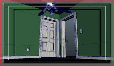
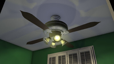
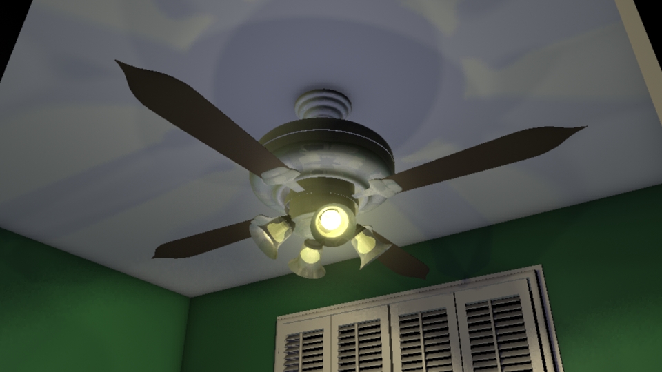
3D Modelling Personal Projects
So I have decided to model my own room for my personal project. I'll add in some fantasy/sci fi elements when I am done just for kicks. These models are all done in Maya. I will be uploading my next batch of WIP.


Venetian Blinds


Door Way and Closet


The Fan

Concept Art Factory Challenge
So the Concept Art Factory is hosting another sketch challenge where students will be redesigning characters from the Neverending Story. I chose to do Morla for my design, so far it is only in sketch phase. I will be developing the sketches further as I find time away from my internship with SCA Transporation Consultants.
 |
| Morla is a depressed turtle so I tried to make the shapes curve down. The shell has to seem heavy and burdensome while the face is long according to the expression "why the long face". |
Tuesday, June 19, 2012
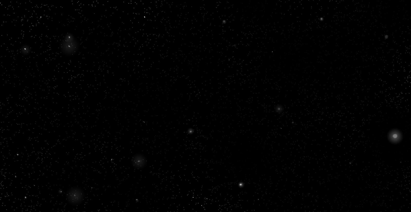
New Background
Well...I got critiqued for having a stock image as my background, so I decided to create my own background, a star field nebula for my the blog. Simple. So I uploaded a series of frame by frame shot of my background WIP so you can see how I did it. Enjoy!
I hope you guys liked the quick demo, if you have any questions, please let me know. Thanks!
 |
| Start with a black background |
 |
Use a soft brush on 1% opacity in dissolve setting. Set fade brush on to control amount of dissolve.
|
 |
| Turn down layer opacity and erase random areas of the star field to make different patches of star recede or pop. |
 |
| Add in larger stars for extra depth and parallax. Use the gradient tool in radial mode to create the halos around the closer stars. |
 |
| I did a lot of work here, but I basically took a soft brush and covered certain areas with white at different opacity. Make sure the focal point has the most white for greatest contrast. Use smudge tool to move the white blotches around. I then used a crunchy brush downloaded from conceptart.org to erase the edges of the central blob to make the gaseous nebula effect. |
 |
| I took the gradient tool and set the mode to vivid light to make highlights brighter and darker regions recede. The gradient is dropped onto the center of the nebula where star clusters are closest. |
 |
| Change file format to RGB. Create a layer and set blending mode to color. It has more saturated, fuller colors, than the overlay mode. I used the gradient tool on normal blending mode to spot the colors. Don't for get to hit some of the stars as well because stars come in different colors based on size, fuel, gravity, and other factors. |
 |
| Set the gradient tool on vivid light again and hit the center with a saturated magenta. Now the night sky is really shining! |
Thursday, June 7, 2012
Phase 4 Senior Project Finals
For my finals at SCAD, I decided to do two final illustrations for marketing purposes. In the gaming and film industry, marketing illustrations tend to be done in a square format so that the advertising department can crop the image. Each object is on a separate layer too so that they can be moved around if the image is cropped. I decided to do a action packed fight scene at night, and a more cinematic city shot of Buckysville to show that I can compose scenes with different moods.
 |
| Chevy Ford Carter vs Beatnik Nick the Robot on their way to Bucky Theater |
 |
| Jack Nick saving Chevy, Janice, and Karen from the clock tower overlooking Buckysville. |
Tuesday, May 15, 2012
Phase III update
Some updates for my Phase III submissions.
Props:
Revolver
DIBBS

Environments:
Clock Tower
Bucky Theater
Props:
Revolver
 |
| The revolver uses nuclear fusion as its power source. I looked at Smith and Wessons for the nub nose design, but ended up going with a more heavy duty body. The revolver chamber is actually the container for the solenoid coils that charges each shot that comes from the fusion cell at the base of the handle. |
 |
| I played with the glow effects. I felt the ones with the body glowing to be too excessive. I decided to combine the simple body of the gun on the bottom with the barrel from the one on the right. |
 |
| Final design for Chevy Carter's revolver. |
DIBBS
 |
| I used alchemy to produce the silhouettes for the DIBBS. I played around with different ways to create an imposing object that would be difficult to remove. DIBBS are suppose to be place holders for people who literally want Dibbs on something. |

 |
| I've got Dibbs on DIBBS! |
Environments:
Clock Tower
 |
| I tried playing around with minimalist designs fro the clock tower since minimalism started to become prominent in the 1950s. However, I liked the quirky zany feel of a world where objects look like familiar everyday things. This resulted in a tower that used cogs as its design motif. |
 |
| I had some perspective issues with the value render. The Aerial perspective effect isn't too bad though. |
 |
| After some perspective tweaks with some red and blue lights, the scene looks reminiscent of Blade Runner. |
Bucky Theater
 |
| Buckminster Fuller is one of my heroes for his visionary talents. His most celebrated designs today is the Bucky Ball which can now be seen at the Epcot Center. I originally designed the building to look like a movie projector, but since the ball is already minimalist, I might as well go that route. |
 |
| The top one looked too Epcot, the left is a glowing soccer ball. I went with the bottom one because it reminds us of something vaguely sci fi, modern era-ish. I really liked the contrast between the round sphere and the triangular body. |
 |
| different color designs for the theater as the gas tubes change colors periodically. |
Wednesday, May 2, 2012
Cerebus Feature Film
Hi everyone, I just want to advertise for a feature film currently in development called "Cerebus". It is based on the comic book "Cerebus" which inspired graphic novelists like Jeff Smith. It is written and illustrated by Dave Sim and today, it is one of the longest running English language comic book series ever printed. I happen to have the good fortune of being contacted by Oliver Simonsen of What Comics Entertainment to animate a short scene for the feature film.
 |
| Come join the fight and follow up on Cerebus the Aardvark's progress! |
Click Here to access the link to my animation contribution to "Cerebus" the animated feature.
Saturday, April 28, 2012
Sequential Art Senior Project Phase I and II
It is the end of midterm week at SCAD. Being the usual busy bee, I am taking two senior project courses for my sequential art and animation majors. For the sequential art project, I am working on 2 character, 2 vehicles, 2 props, 2 environment, 2 final concept illustrations, along with a 200 panel storyboard, and a written treatment for my video game concept.
"Think Fast" is the name of my senior project; it is about Chevy Ford Carter, a private investigator from Buckysville who is disgruntled about his boring job until he picks up a case on a killer beatnik robot. The story aesthetics are influenced by the 1950s and features dark humor with science fiction elements of the Fall Out series while retaining a quirkiness found in the Sci-Fy channel series Eureka.
So far I have completed 10 thumbnail sketches for each character/vehicle, 3 value studies for each character/vehicle, and 1 full color concept illustrations for each character/vehicle. Enjoy!
 |
| From this silhouette study, I felt that the ones where Chevy's shoulders are sagging with an unbuttoned coat were strongest at portraying an unkempt and unhappy fellow. |
 |
| The value study portion. I noticed that my design did not look sci fi enough, in fact the character looked almost stereotypical. |
 |
| Final Protagonist Character Concept for Chevy Ford Carter |
 | ||
Jack Nick has to look human so all the wacky designs with bulbous looking robots are out. In here, I started adding in clothing to give the robot a more interesting silhouette design. I focused primarily on the sunglasses and the V shape it created. I liked the silhouettes where Jack Nick looks tough and has strong arms to contrast with the thin arms. My influence for the clothing was Bob Dylan.
|

 |
| Final Antagonist Character Concept for Beatnik Nick the Robot |
 | ||||
The Ford Nucleon was also designed by the robot's creator. It is the only civilian flying car since law forbids average citizens from having one due to potential traffic hazards. The historical Nucleons were supposed to have a nuclear reactor as its power source. Obvious concerns over radiation poisoning and other hazards caused it to be scrapped. had a lot of fun designing the Nucleon. It had to sleek, fast, and agile. The first couple of designs were not my favorites because they looked too much like muscle cars. The final design actually had a shape that contrasts well with the police car.
|


 | ||
Police cars from the 1950s had a charm to it because of the way the passenger compartment rides closely to the back. The police cars have to contrast sharply with the nucleon in that it has to be imposing, strong, and powerful. Some of the silhouettes looked like taxi cabs and others were too futuristic. The most successful one has a powerful front and the back features a propulsion system seen only in a sci fi world.
|

 |
| Police Car Vehicle Concept |
Tuesday, January 31, 2012
GENERATE 24 Hour Art Challenge Fall 2011
So I am finally uploading my GENERATE 2011 character concepts. The challenge last year was to make a pitch to Turner Studios for a tv program that lasts 26 episodes. Each team can have 4 members. Each team is given a sponsor and a tv channel to pitch to. The teams have to create a pitch to explain what our show is about, a 26 episode summary list, 3-5 character concept full colors, 3 marketing products, as well as a working animatic. I helped with a majority of the story development, proofread the summaries, delivered the pitch, illustrated the final character concepts, and worked on the animatic. At the same time, I had to manage the team to make sure we are on time and that each member has someone else to help them with the work.
Our team came received SciFi channel, and AT&T as our sponsor. Our story is called "Fail Safe". It is about a company that created genetic superhumans to help with jobs considered too dangerous for normal people. However, the experiments went rogue and innocent bystanders were killed. To rectify their mistake, the company sends Alan, their Fail Safe to track down and eliminate the experiments. Along the way, Alan finds out that he and the experiments are very alike and it is up to him to determine whether to go through with his mission, side with his people, or find some way to make a compromise.
We came in third place at GENERATE and the people at Turner said that our show could potentially spawn up to 10 seasons in concept. Not too shabby considering that it was my first time working the Animation challenge. So without much ado, here are some of the character concepts I have helped come up with.
 |
| Alan- Main protagonist |
 |
| Correspondent who keeps in touch with Alan with his missions. |
 |
| Lucas- the news journalist investigating what went on with the experiments. He eventually meets Alan and they form a partnership. |
Winter Candyland
So during the winter, I got a commission to illustrated a winter wonderland. I thought, "wouldn't it be cool if the characters ventured in on candy land?" Well here it is. I still have a few more revisions to do like adding snow onto the candy and the tree in the background.
 |
Hades Concept Art: Color Study
So after my value study, I have finally completed the colors. I might play around with the blue since some people told me it reminds them of Poseidon. Apparently the original Hades has black as a motif but if that's the case, I might as well leave it in value study (and black is not a color).
 |
| Hades Color Study #1 |
Sunday, December 11, 2011
Hades Concept Art: Value Study
So Concept Art Factory has been a bit sluggish lately so a couple friends of mine have decided to start on a series of projects involving the revamping of Greek Mythological characters.
I know it has been done to death, but there have been so many misinterpretation of Hades. People see him as the grim reaper because of Judeo Christian interpretation but the original Greek Hades was far from sinister.
I gave him somewhat a druidic look with the skull/athenian style helmet. Cerberus is referenced in his shoulder pauldron and the dog skin sleeve covering. His body twists like cypress tree roots and I thought it'd be a nice theme to tie him in with my next design with Persephone.
 |
| Hades Concept |
Subscribe to:
Posts (Atom)