Contributors

Sunday, December 11, 2011

Hades Concept Art: Value Study

So Concept Art Factory has been a bit sluggish lately so a couple friends of mine have decided to start on a series of projects involving the revamping of Greek Mythological characters.

I know it has been done to death, but there have been so many misinterpretation of Hades. People see him as the grim reaper because of Judeo Christian interpretation but the original Greek Hades was far from sinister.

I gave him somewhat a druidic look with the skull/athenian style helmet. Cerberus is referenced in his shoulder pauldron and the dog skin sleeve covering. His body twists like cypress tree roots and I thought it'd be a nice theme to tie him in with my next design with Persephone.

Hades Concept

Saturday, September 3, 2011

Smuggler Vehicle

So as a continuation for my concept art class assignment, we have to design a vehicle for one of our characters in the story we had created. This speeder is designed for my smuggler. The world I have created is like a sci-fi western so the head of the speeder looks like a horse and the back of the speeder is a compartment for the smuggler to hide his stuff in. I kept to the circular designs because the vehicle uses magnets as a way to levitate.

Vehicles in the world of Pleiades 7 will use an electromagnetic propulsion system. It manipulates the magnetic field around them by mimicking the same charge as the electrons in the field around the vehicle. In magnetism, opposite forces attract and similar forces repel each other. In theory, if the propulsion system is equal in charge and greater in strength to the magnetic field, the vehicle will achieve levitation. The magnetic solenoid pads can swivel so that the speeder is able to move in all direction/rotation- it can even do barrel rolls. The smaller magnetic pad at the top can also be used to set the speeder upright if it topples over.


Wednesday, August 3, 2011

Color Studies for Concept Art Factory

After having completed my value studies, I started on my color studies for the protagonist and antagonist characters for my story. I take the strongest value study and develop it further by adding color layers. The color layer allows me to change the scheme to which ever I want and see if the new designs echo what I want my character to look like.


My Five Color Studies. I played around with cape colors, and the eye glow.


Version 1

Version 2

Version 3

Version 4

Version 5


Saturday, July 23, 2011

Value Studies for Concept Art Factory

Hey everyone! Today I am posting my value studies for the selected silhouettes from last week's post. My theme is smuggler and law men in space.

Smuggler- Protagonist

I am really liking the smuggler's asymmetrical design because it enhances his villainous qualities. He starts off as a black and white character but gradually becomes morally grey as he betrays the people he works for. I kinda liked the scaled plates since they remind me of a snake or serpent which illicit a strong connotation of villany, but I felt that the one with the bamboo-like armor represents a more slapdash assortment of items. The story is designed for a game so the character should be customizeable which means this character is a stock character (the character players start off with before they customize him/her). In the final design I will make him modular once I have the design for the props completed. So stay tune for the final illustration!

Lawman- Antagonist
The lawman was giving me some problems in the beginning because I wanted something tough but also space worthy. My initial designs featured a man in a powersuit with armor reminescent of judge dredd. As i designed more and more, logistics made it seem odd as to why a law man would be wearing such bulky armor. The concept of armor is more for mercenaries and soldiers rather than a lawman. As a result, I turned to more down to earth references like SWAT and rangers which I feel yielded better results. The final value study depicts the law man with an open jacket with a badge, shin guards and elbow guards for roughin' it, and his wide brim hat. Since the character has an open jacket, he seems rather relaxed so to keep the idea of some professionalism, the hat is designed to look straight and stiff. I will be doing some value studies next week so wait for more to come!

Saturday, July 9, 2011

Silhouettes for Concept Art Factory Design Challenge

Hey everyone, we are in week 13 of the SCAD Concept Art Factory Club sketch challenge. Usually we do a speed paint but this time we want to focus on design rather than the illustration aspect of Concept Art. All good concept art pieces start off with that nugget of idea which we develop into quick drawings called Silhouettes. In the silhouette stage, we try to use surface shapes to develop the personality of the character we are trying to create.

This week, members of the club choose any sort of theme they want, whether it is robot wars, or space western. They then choose two characters from the story they have developed and create as many thumbnails as they can in the 90 minutes period. For my theme, I chose Space Western with Asian theme.


The two characters I will be developing are the smuggler and the lawman.

When I started designing the smuggler, I thought about clint eastwood and the stereotypical bandito from western films. They usually wear the iconic poncho and hat. I took the idea of the poncho, but changed the sombrero to the asian bamboo straw hat. I also made sure the poncho covers only a portion of the body to make the silhouette look asymmetrical. The smuggler in my story is a lone wolf and is dangerous so the asymmetry makes him look less orderly and more chaotic. I chose the snake as a motif for the character because the poncho creates a silhouette similar to the hood of a cobra. The contrasting creature to the cobra would be the eagle.


For the Law man, I wanted to use the eagle motif as a contrast to the smugger's cobra. I also remember judge dredd with eagle wings as the shoulder pauldron design. I initially tried some armors but the lawman ended up looking very much like mercenaries and soldiers than "lawman". Robo cop didnt work either because he looked more soldier than lawman. That's when I remembered the rangers from Fall Out had armor and the cowboy hat so I took that idea and ran with it.

Sunday, June 26, 2011

SCAD Concept Art Speed Paint Challenge

Alright guys, its another edition of the SCAD Concept Art Factory Speed Paint Challenge submission! This time we are doing a 3 hour concept piece about cyborg crustaceans versus fungal natives and combines environment, architecture, vehicle, character design, and architectural design- WOW! so here it is after 3 hours and a additional 2 hour tweak.

I will go back and rework the foreground tree when I have time since it seems have the same saturation as the one in the immediate background.


Wednesday, June 15, 2011

RIFT Colossus Challenge- Life Elemental

Awww yeah, finally finished my concept piece for the Rift Colossus challenge. Though I wanted to do all six elementals (fire, water, earth, wind, life, and death) I have narrowed down to two that are more obscure and challenging to do and they are life and death. Life was rather hard to tackle because you do want it to look too much like earth and its kinda weird saying that I am killing someone with life damage. I figured life would be kind of like a cancerous vegetation growth that continues to grow till it over flows its boundaries much like the Yavimaya forest from the Magic the Gathering Series.

My inspiration for this piece is the Corpse Flower. How ironic that something that is used to depict a life elemental is named after something that is related to death! I wanted to throw together a piece about creation and destruction with the two elementals because they go hand in hand, neither one is stronger than the other. So here is my process leading up to the finished Life Elemental concept painting.

I first laid out the base color I will be using predominantly through the scene. I normally use purple and yellow as my color palette but this time I decided to go with blue and green since it fits with nature more. I will be using purple and yellow more in my death piece because purple is more unnatural and exudes a mysterious atmosphere.

I then gestured out the silhouette with the base tone that will make the creature pop up from the background. I chose a reddish purple because the corpse flowers have that violet red petal.

I then added in vegetation to the layer below all my subsequent layers since it will be pushed back by the flowers coming out the creatures body. I also went ahead and rendered in objects that will be pushed back like the arms and legs. I referenced bristlecone pine trees because they have that unique twist to the trunk along with the beautiful crevasses produced by its knots.

I then painted in the more prominent objects like the corpse flowers and the left arm which is larger.

I finished off the character concept with final details like the dots characteristic to corpse flowers, the teeth to enhance the fantastical quality of the creature as well as tweaked the saturation so that the creature will stand out from the environment I will be creating.

I blocked in the environment into two major portions, the sky and the ground. I used some texture brushes to indicated where trees are going to go.

I then refined the background further to get rid of the texture brush place holders and started working on aerial perspective. I refined the water fall since it is so far away in the background. I also used a but of Sfumato on the bushs in the background. I also saturated the foreground so that it stands out from the desaturated background.

Started to add in some palm trees.

Now I have to work in the foreground.

Then I add in final details.

And to finish off the piece, I tweak the saturation more so that I have a series of contrasting layer with darker colors, lighter colors, and darker colors to make my environment and creature stand apart from one another.

So that's it for my Life Elemental. The entire process took me about two days nonstop. Stay tuned for DEATH!!!

Saturday, June 11, 2011

Baba Yaga environment and architecture concept

The Weekly Sketch Challenge for the SCAD Concept Art Factory is a continuation of the Baba Yaga theme. This time we do architecture and environment. Last week was creature and character.


Saturday, May 7, 2011

Concept Art Factory Underwater Vehicle Challenge

Our new challenge in the Concept Art Factory for May the 7th is  "futuristic, underwater military transport going to war". Here is my rendition for today's challenge. We had a total of 90 minutes to finish the speed painting.

A race of squid like aliens combine technology with biological organisms to create a troop transport vehicles that fire augmented squids as defensive weaponry. The missile ports on the back of the craft is reminiscent of pores in a Suriname Frog. It also has a hangar that holds squid like mechas for deployment. The main engine is a triple helix design similar to the gungan ship from Star Wars but it has a webbed membrane around the spokes so that it could effectively tread water. The two fins are used to angle the ship so it can rise and fall. The membranes are selectively permeable so water certain things are allowed in and out of the craft.

See more of the concept art submitted by my fellow classmates, check out http://conceptart-factory.blogspot.com/.

Tuesday, May 3, 2011

Finished Creature Design Concept

I finally finished my design for my Creatures Anatomy class. This is a value study for the creature I will be using in an illustration later. The premise of the story behind the illustration goes like this:

"A group from a village deep in the heart of Siberia has decided to investigate a small town in which no one
has heard from in over a week. As they get closer to the isolated town, they see several trees have been
leveled. These trees, as well as several others still standing, have several deep “scraps” on its surface.
Nearby, they discover large footprints with massive claws that are arranged in the fashion in which a
quadruped walks. As they follow the footprints through the village, they discover the bodies of the
townspeople have been aligned under underneath the surface of the snow. They are covered in a film that
looks to preserve the bodies. While cutting back the film from the victims, a small portion of the substance
touches one of the villagers face and a tingling sensation instantly occurs. At closer investigation, they see
that there are severe bruises all over the victims and puncture holes on the left and right side of the temples.
These punctures seem to be the only cause of lost blood. They villagers follow the footprints from the village
to the edge of the forest where the come across a large construction made from the trees found the area.
The construction has a wide opening that goes into the ground. The villager’s face that came in contact with
the film is now completely paralyzed."

My design for the creature incorporates parts from various animals. The body references a walrus, the hands are like moles for digging, the frills around the neck are like the dilophosaurus's, it's tongue can extend and retract like a chameleon's and the tongue spits out poison. The animal is toothless but its jaws detach like a snakes so it can swallow a prey while it lies in waiting like a wolf spider in a burrow or an ant lion. When it swallow's it's prey, the prey is stored in a pouch like sac in its throat like rodents where the creature then secretes a film around the prey. Back at the burrow, the prey is left to age in a marinade of digestive juices filling a transparent membrane sac. The creature returns periodically to drink the fluid from the sac for nourishment since it is hard to come by prey in the siberian region.

From top left clockwise: Study of head (notice the frill used for sensing the size of tunnels the creature moves around in and the tongue that spits paralyzing venom), Membrane Sac with a hapless prey still inside, Three quarter view of the monster in its entire glory, the pouch for storing prey (one is a transparency so you can see how the prey creates a bump in the skin so you can tell whether the creature has been eating or not).


Tuesday, April 12, 2011

Completed Sketch Challenge

Finally finished my speed paint challenge for the Concept Art Factory. Unfortunately the painting was delayed because of the Career Fair at the SCAD Savannah Campus.

Our theme was Evil, Medieval, African racer, with animals. I took influence from the Oliphant from the Lord of the Rings.

Friday, April 1, 2011

SCAD Concept Art Factory first meeting

I am so excited! SCAD finally has its official Concept Art club called the Concept Art Factory. We met for the first time and are about to make it official. Our officers have been decided and everything is underway!

Check out our blog:

concept-art-factory.blogspot.com

Monday, February 7, 2011

Concept Design Development: Chronicles of Marduk- Aeon's End

So I have been working on a personal story for about 3 years now since I was in high school, but it wasn't until now that I have actually started concept design for characters. All the time before was dedicated to getting the story fleshed out and I think it's in a stage where most of the essentials are down.

I made a series of silhouettes to get the general form of mechas that will appear in the story. There will be generic designs for normal government issues as well as more customized designs for specific characters in the story like the Pope.


I made sure the designs had some sort of thematic quality to them such as the body shape made from triangles and circles to hint at the gracefulness and the danger each model presents.

I kinda liked the thin frames because it has such a huge contrast from the bulkier look. That might be why I liked Evangelion designs. One of the main thing my story focuses on is the advent of psionics and the ability to amplify electromagnetic waves generated by the brain. The mechas must have a way to generate energy to power the psionic device. So I decided to use the circular structures on the back of the mechas as chargers which absorb electrons and other energies in this sci fi world to replace energy lost during psionic discharges. I really liked the design for the Pope's mecha (pope mobile XD) which has the weird tentacles coming from it. I refined the details for the silhouette.

The clam shell design was influenced by a Youtube music video for Vivaldi.

So this is the design I have come up with. It is a mecha with one face, but it is a mixture of two drama masks, one smiling, the other sad. I played around with other mask ideas but I thought the dual masks represented the dual nature of the Pope thus reinforcing symbolism and making the design more iconic.

New Temple of Cartoon Mojo Sketch Challenge Submission!!!

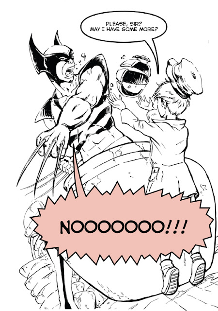
Hey Guys, I just submitted my Sketch Challenge for Wolverine at the Temple of Cartoon Mojo:

Yup, Oliver Twist and Wolverine. I have a feeling that this is going to be a rather Warm-Hearted adaptation of Charles Dickens's famous story.